
Guide to Business Card Typography

Your business card typography sets the foundation for clear communication. The right font choices help potential clients quickly find your contact information and understand what you offer. In just a few square inches, your text needs to convey professionalism while staying easy to read.
This guide will show you how to select and use fonts that work well on business cards, with practical tips for creating cards that represent your business effectively.
Related Article: Complete Guide to Business Card Printing
Picking the Right Font for Your Business Cards
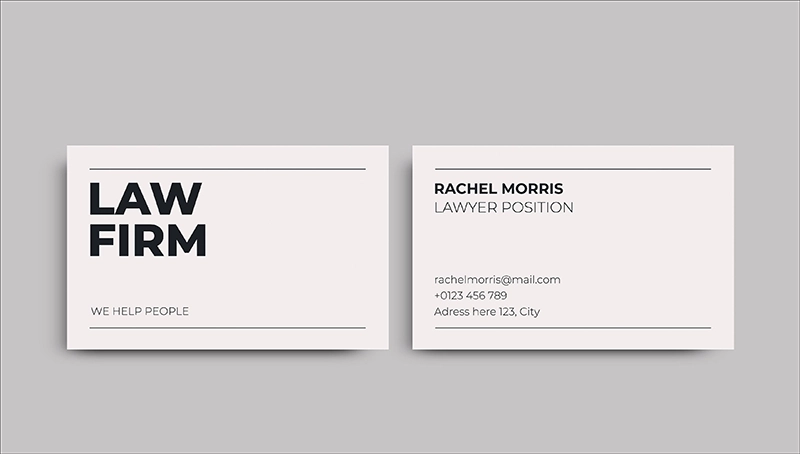
Clear typography starts with selecting the right fonts for your business card. For professional results, stick to two fonts maximum – one for your name and company, another for contact details.
For your primary font, consider these proven options:
- Sans-serif fonts like Arial, Helvetica, or Proxima Nova work well for modern businesses
- Serif fonts like Garamond, Times New Roman, or Adobe Caslon suit traditional industries
- Choose fonts that match your existing business materials for consistent branding
When pairing fonts, follow these guidelines:
- Use your primary font for your name and company name
- Select a simpler secondary font for contact information
- Ensure both fonts complement each other without competing
- Test different combinations to find what looks best together
Avoid decorative or novelty fonts that can be hard to read at small sizes. Script fonts should only be used sparingly for names or titles, never for contact details. The goal is to create a hierarchy that guides the eye while maintaining professionalism and readability.
Related Article: Business Card Design
Font Size Guide for Business Cards
Getting your font sizes right ensures people can easily read your contact information. The key is creating a clear visual hierarchy while keeping everything legible.
Names and Titles
Your name should be the largest text element on the card, typically between 10-12 points. This makes it stand out as the primary information. Set your job title slightly smaller, around 8-9 points, to create a natural visual flow. For your company name, use 9-10 points if it’s a key focus, or 8-9 points if you want your personal name to take precedence.
Contact Information
Phone numbers and email addresses need to be easily readable:
- Phone numbers work best at 8 points
- Email addresses should be 7-8 points
- Websites can be 7-8 points
- Physical addresses can go as small as 7 points
Size Testing Tips
Before finalizing your design:
- Print a test copy and hold it at arm’s length
- Check readability in different lighting conditions
- Have others verify they can read all text easily
- Consider older clients who may need larger text
- Test your smallest text on your chosen paper stock
Remember that different fonts appear larger or smaller even at the same point size. Always print a proof to verify your text is readable before placing your final order.
Font Colors That Work
Font color choices dramatically affect how easily people can read your contact information. The right color combinations ensure your cards remain readable in various lighting conditions.
Color Contrast Guide
| Background Color | Best Text Colors | Minimum Size | Notes |
|---|---|---|---|
| White/Light | Black, Navy, Dark Gray | 7pt | Most reliable option |
| Black/Dark | White, Light Gray, Cream | 8pt | Needs larger size |
| Colored | Black or White | 8pt | Test contrast ratio |
| Textured | Solid Dark Colors | 9pt | Avoid light colors |
Dark Text on Light Cards
Black text on white or light-colored cards provides maximum readability. This classic approach works well for:
- Professional services
- Medical offices
- Legal firms
- Financial advisors
- Real estate agents
Use rich black (C:60 M:40 Y:40 K:100) instead of plain black (K:100) for better print results. This creates deeper, more professional-looking text.
Light Text on Dark Cards
When using light text, follow these guidelines:
- Increase text size by 1 point compared to dark text
- Avoid thin fonts that might disappear
- Test print to verify readability
- Use pure white instead of off-white shades
Color Combinations to Avoid
- Low contrast pairs (light gray on white)
- Similar color shades (dark blue on black)
- Bright colors that strain eyes
- Colors that clash with your logo
Remember: Your business card needs to remain readable even in dim restaurant lighting or bright outdoor conditions. When in doubt, opt for higher contrast over subtle design choices.
Setting Up Your Fonts
Proper spacing and alignment create a polished, professional look. The right layout ensures every element on your card works together effectively.
Spacing Guidelines Table
| Element | Minimum Space | Optimal Space | Notes |
|---|---|---|---|
| Line Spacing | 10-12pt | 14-16pt | Varies by font |
| Letter Spacing | -5 tracking | 0 tracking | Adjust for readability |
| Logo Margins | 0.125″ | 0.25″ | Keep consistent |
| Edge Margins | 0.125″ | 0.1875″ | Protects from trimming |
Text Alignment Tips
- Left-aligned text is easiest to read
- Center alignment works for names and titles
- Keep related information grouped together
- Maintain consistent spacing between groups
- Allow adequate white space around elements
Bottom Line
A well-designed business card combines clear typography with proper spacing to create an effective networking tool. Follow these key points for professional results:
Quick Typography Checklist
- Choose 1-2 professional fonts
- Set text sizes for easy reading
- Use high-contrast color combinations
- Maintain consistent spacing
- Include adequate margins
Our design team can review your typography choices and suggest improvements before final printing.
Frequently Asked Questions
What size font should I use for contact information on business cards?
Contact information on business cards requires specific sizes: phone numbers and email addresses should use 7-8 point fonts minimum. Your name should be 10-12 points, and your title 8-10 points. Never go below 6 points for any text to maintain readability.
Can I use script fonts on business cards?
Use script fonts sparingly on business cards. Limit script fonts to names or company names only, and select ones that remain readable at small sizes. Always pair script fonts with a clear sans-serif font for contact details to ensure people can read your information.
How many different fonts should I use on a business card?
Use a maximum of two to three fonts on your business card. One font for your name/company, another for contact details, and optionally a third for accents. Using more fonts creates visual clutter and reduces professionalism.
Should business card fonts match my brand fonts?
Yes, business card fonts should align with your brand fonts when possible. If your brand fonts don’t work well at small sizes, choose similar alternatives that maintain your brand’s style while ensuring readability in print.