
Complete Guide to Business Card Design
Your business card does more than share your contact details – it’s often the first piece of your business that potential clients take home. Getting your business card design right means the difference between a card that brings in business and one that ends up in the recycling bin.
In this guide, you’ll learn exactly how to create business cards that work hard for your Denver business. We’ll walk you through everything from choosing the right logo placement to picking colors that catch attention. You’ll discover what designs are bringing success to businesses in different Denver neighborhoods, from the Tech Center to RiNo.
Let’s start creating business cards that help you stand out and connect with the right people in Denver’s competitive business scene.
Design Elements That Work
When you create your business card, getting your key design elements in the right place makes all the difference. Here’s what you need to know about placing your logo and using colors that grab attention.
Logo Placement and Sizing
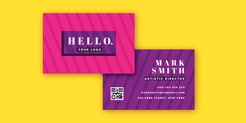
Put your logo where it’ll catch the eye right away. For most cards, this means placing it in the top left or center of your card. Your logo should be big enough to stand out – aim for it to take up about 25% of the card’s space. But don’t let it overshadow your contact information.
Think about whether you want your logo in color or black and white. While color logos pop, sometimes a black and white version looks cleaner and more professional.
Colors That Connect
Your brand colors tell your story, so use them wisely on your card. Pick 2-3 colors that match your brand and stick to them. Going overboard with too many colors can make your card look busy and unprofessional.
Remember these color tips:
- Dark text on light backgrounds is easiest to read
- Save bright colors for your logo or small design elements
- Consider how your colors will look in different lighting
When you’re choosing colors, think about how they’ll print. Some bright colors might look great on your screen but won’t print exactly the same way. Our print team can help you pick colors that will look just as good on paper as they do on your computer.
Design Tips for Denver Professionals
Let’s look at what works for different types of businesses right here in Denver. We’ve helped thousands of local professionals create cards that fit their specific needs.
Industry-Specific Approaches
Real Estate Agents
Your card needs to help you sell homes. Try adding a small headshot – Denver home buyers want to know who they’re working with. Put your photo on one side and keep all your contact details on the other. Many successful agents include a QR code that links to their listings.
Tech Startups
If you’re working in Denver’s growing tech scene, your card should feel modern and clean. Many Tech Center startups use minimalist designs with lots of white space. Think one or two colors max, with your web address front and center.
Professional Services
For lawyers, accountants, and consultants in downtown Denver, we recommend classic designs that build trust. Dark blues and grays work well, along with traditional layouts that put your credentials and specialties front and center.
Local Design Success Stories
The design that works in one part of Denver might not work in another. Here’s what we’ve seen bring success:
Denver Tech Center
Clean, modern designs rule here. Many DTC businesses use sleek layouts with bold company names and simple contact details.
RiNo District
Creative professionals in RiNo often choose unique paper types and bold color choices. Art gallery owners and designers here stand out with textured papers and special finishes.
Downtown Core
Traditional professionals in downtown Denver get great results with classic designs that feel established and trustworthy. Many use raised printing or subtle metallic accents to add sophistication.
Common Design Mistakes to Avoid
Let’s talk about what can go wrong with business cards so you can get yours right the first time. We’ve seen thousands of business card designs, and these are the issues that pop up most often.
Space and Layout Issues
When you’re excited to share all your information, it’s easy to overcrowd your card. But here’s the truth – a crowded card is hard to read, and people won’t take the time to figure it out.
Here’s what to watch out for:
- Keep text at least 3/16 inch from the edges of your card
- Don’t squeeze in too much text – pick your most important contact details
- Make sure your phone number and email are big enough to read easily
Think of your card like a highway sign – people need to get the message quickly. If you can’t read all the text from arm’s length, it’s too small.
Print Production Problems
The design on your screen needs to work just as well on paper. Here are the main issues we spot before they become expensive mistakes:
Low-Resolution Logos
Your logo might look great on your computer, but blurry logos on printed cards look unprofessional. You need a high-resolution file – at least 300 DPI. Not sure if your logo is high enough quality? Send it our way, and we’ll check it for you.
Color Bleeding
When colors run into each other, it’s called bleeding. To prevent this:
- Leave space between different colored elements
- Choose paper that works with your design
- Use the right color settings for printing
Paper Choice Problems
Different papers work better for different designs. Dark colors might not show up well on textured paper. Glossy finishes can make text hard to read. We’ll help you pick the right paper for your design before we print.
Creating Your Business Card
Let’s walk through exactly how to create your business card, step by step. We’ll make this process simple and clear.
Step-by-Step Design Process
Start With Your Information
Pull together everything you want on your card:
- Your name and job title
- Company name and logo
- Phone number and email
- Website and social media
- Physical address (if you want it)
Choose Your Layout
Think about how people will use your card. Put the most important details where they’re easy to spot. Most people read from top to bottom, left to right, so place your name and company where eyes naturally land first.
Pick Your Fonts and Colors
Keep it simple with two fonts max:
- One for your name and company
- One for contact details
- Make sure both fonts are easy to read
- Stick to your brand colors
File Setup Guidelines
Getting your files right means your cards will print perfectly. Here’s what you need:
Required Formats
- Send us your design in PDF format
- Keep all your fonts and images at 300 DPI
- Include your original design files if you have them
Size and Margins
- Standard size: 3.5 x 2 inches
- Add 1/8 inch bleed on all sides
- Keep important items 3/16 inch from edges
Bottom Line
Your business card is an investment in your success. When you get the design right, it does more than share your contact details – it brings you business.
Ready to create your business cards? Our Denver team is here to help. We’ll make sure your cards look exactly how you want them, and we’ll deliver them right to your door in 3-5 days.
Give us a call or order online today. We’ll help you create business cards that get you noticed in Denver’s competitive business scene.
Frequently Asked Questions
What information must be on a business card design?
A business card design must include your name, company name, job title, phone number, email address, and website. Include your physical address if you have a storefront. Optional elements include social media handles, QR codes, and professional certifications based on your industry needs.
How do I design my own business cards?
Design business cards by first choosing professional design software or an online template. Add your logo, contact details, and company information using a clear hierarchy. Select appropriate fonts and colors that match your brand. Ensure all text is readable at 8pt size minimum.
What size should a business card design be?
Standard business cards measure 3.5 x 2 inches in the US. When designing, include a 0.125-inch bleed area on all sides, making the design file 3.75 x 2.25 inches. Keep important content within a safe zone, at least 0.125 inches from the trim edge.
What are the best fonts for business card design?
The best fonts for business cards combine serif fonts for company names and sans-serif fonts for contact details. Popular professional options include Arial, Helvetica, Garamond, and Open Sans. Use 8-12pt size for contact information and 10-14pt for names.


Pingback: Die Cut Business Cards Denver