10 Essential Marketing Postcard Elements That Drive Results
Creating Marketing Postcards That Convert
Are you planning a direct mail campaign but unsure how to create postcards that actually get results? You’re not alone. Many businesses struggle to design marketing postcards that stand out from the pile of mail people receive daily.
This comprehensive guide covers the 10 critical marketing postcard elements that top-performing businesses incorporate into their campaigns. Based on research and real campaign data from Denver and beyond, these elements significantly impact open rates, engagement, and conversions.
Whether you’re printing 4×4″ square cards or full 8.5×11″ mailers, understanding these components will help you create postcards that recipients notice, read, and act upon.
Element 1: Attention-Capturing Headlines for Marketing Postcards

Your headline must quickly grab the reader’s attention and communicate your main message in seconds—before your postcard ends up in the recycling bin. See our guide on how to write compelling postcard headlines that get results.
Size-Specific Headline Approaches
- For 4×6″ postcards: Limit to 5-7 words maximum (e.g., “Denver’s Best Happy Hour”)
- For 8.5×11″ postcards: Use a two-tier headline structure with main and supporting statements
Effective Headline Examples
- Cherry Creek retail businesses succeed with simple messages like “Shop Local, Save Big”
- Denver restaurants see strong results with “Brunch With a Mountain View”
The most effective headlines speak directly to local interests and needs. For Denver audiences, references to neighborhoods, outdoor activities, or local events consistently produce higher engagement rates.
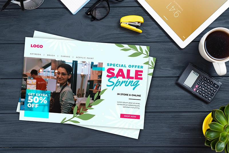
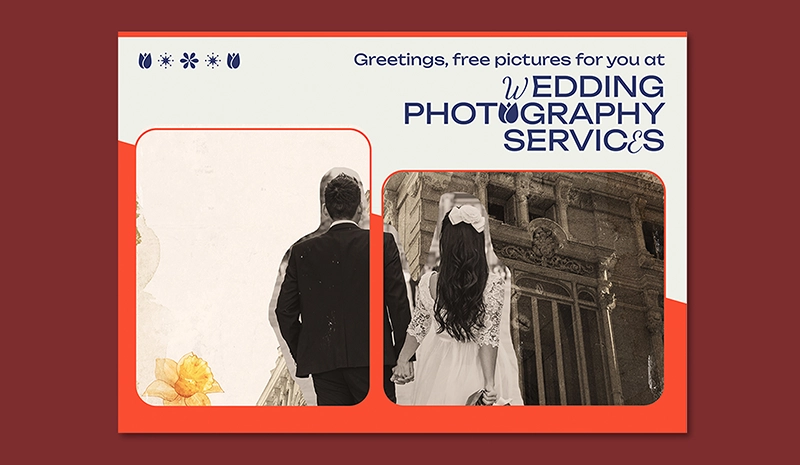
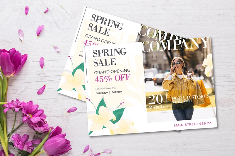
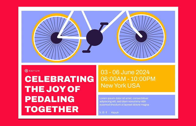
Element 2: Strategic Postcard Visuals and Images
Visual elements communicate faster than text and create immediate emotional impact. Your image choices should align with your postcard size and marketing objectives.
Size-Appropriate Visual Strategies
| Postcard Size | Optimal Image Approach |
|---|---|
| 4×4″ Square Postcards | Single bold image (no borders) |
| 5.5×8.5″ Half Page Postcards | Split-panel or before/after displays |
| 8.5×11″ Full Page Postcards | Multiple images with clear visual hierarchy |
Visual Design Best Practices
- Use color profiles with 30% more saturation for Denver’s bright, high-altitude light conditions
- Include recognizable local backdrops to create community connection
- Ensure images directly support your core message
Product photos, before-and-after comparisons, and images of people using your products or services consistently outperform abstract visuals. Local businesses should consider including recognizable Denver landmarks or neighborhood scenes to increase relevance.
Element 3: Clear Postcard Value Statements
Recipients need to understand quickly what you offer and why it matters to them. Your value proposition must be immediately clear.
Space Allocation Guidelines
- 5×7″ postcards: Limit to a 25-word maximum proposition with top-right placement
- 6×9″ postcards: Expand your value statement with 2-3 supporting bullet points
Value Proposition Strategies
- Address specific local concerns like weather-related services or altitude-specific offerings
- Position your main value statement “above the fold” on standard 5.5×8.5″ formats
- Focus on specific benefits rather than general features
Testing shows that value propositions focused on specific benefits consistently outperform general statements. For Denver businesses, highlighting local expertise or solutions to regional challenges produces particularly strong results.
Element 4: Postcard Personalization Techniques
Personalized postcards receive 29% higher response rates than generic mailers according to recent marketing studies.
Personalization Options By Size
- 4×6″ postcards: Include first name + neighborhood (e.g., “For Highlands Homeowners”)
- 8.5×11″ postcards: Implement full personalization with property images for real estate mailers
Segmentation Approaches
- Create ZIP code specific messaging (tailored content for different Denver neighborhoods)
- Develop different approaches for new residents versus long-term locals
- Vary offers based on customer purchase history or demographics
Even basic personalization like using the recipient’s name increases response rates significantly. More sophisticated options include varying offers, images, or messaging based on demographic or behavioral data.
Element 5: Response-Driving Postcard Offers
A compelling offer bridges the gap between interest and action. Discover more about writing the best postcard offers and promotions to drive response rates.
Format-Specific Offer Placements
- 4×4″ postcards: Position a single clear offer in the center
- 5.5×8.5″ postcards: Present multi-tiered offers with prominent expiration dates
Offer Optimization Tips
- Create different promotions for weekdays versus weekends based on local traffic patterns
- Use seasonal themes aligned with Denver’s distinct climate patterns
- Test percentage-off versus dollar-amount discounts for your specific audience
The most effective offers create urgency through limited availability or quantity restrictions. Testing shows that Denver customers respond particularly well to seasonal offers tied to local events and weather changes.
Element 6: Action-Oriented Postcard CTAs
Every postcard needs a clear next step for the reader to take—your call-to-action is what converts interest into measurable results.
Size-Based CTA Design
- 4×6″ postcards: Include a single bold CTA button (minimum 1″ width)
- 6×9″ postcards: Create a primary/secondary CTA hierarchy for different customer types
CTA Best Practices
- Use specific action verbs (“Reserve,” “Call,” “Visit”)
- Create urgency with time-limited language
- Make your CTA stand out through color contrast and positioning
- Include a QR code for quick digital response options
Using action verbs and creating urgency consistently improves response rates. The CTA should stand out visually through color contrast, size, and strategic position on the postcard. Your CTA converts interest into measurable results. For more detailed guidance, check out our guide on creating effective calls-to-action for your postcards.
Element 7: Accessible Contact Information
Make it simple for customers to reach you through their preferred communication method.
Size-Appropriate Contact Formats
- 4×4″ postcards: Include only QR code + phone number
- 5×7″ and larger postcards: Provide full contact details with location map
Contact Presentation Tips
- List contact methods in order of customer preference
- Reference proximity to local landmarks for physical locations
- Include transportation options for Denver locations
Multiple contact options increase response rates by allowing customers to choose their preferred communication channel. For Denver businesses, including parking information and transit accessibility can significantly impact visit rates.
Element 8: Distinctive Design Elements
Special finishes and techniques make your postcard stand out from others in the mailbox, increasing the chance it gets noticed.
Finish Options By Postcard Size
- 5×7″ postcards: Add spot UV coating for luxury services
- 6×9″ postcards: Consider textured stocks for outdoor businesses or natural products
Design Psychology Factors
- Select color schemes that remain vibrant in high altitude conditions
- Use weather-resistant finishes for mountain mail routes
- Create contrast between your postcard and typical mail items
Strategic use of color, contrast, white space, and special finishes significantly increases a postcard’s impact. When adding special finishes or design elements, make sure you avoid common postcard mistakes that could negatively impact readability or effectiveness.
Element 9: Brand Consistency
Your postcard should instantly connect to your overall brand identity to build recognition and trust.
Scaling Brand Elements
- Adjust logo sizing proportionally for each format (from 4×4″ through 8.5×11″)
- Maintain color accuracy despite Denver’s high-UV environment
- Use consistent typography across all marketing materials
Brand Recognition Techniques
- Integrate neighborhood aesthetics for local relevance
- Maintain consistent visual language with your other marketing channels
- Ensure your postcard visually connects to your website and storefront
Consistent use of your logo, colors, fonts, and design elements builds recognition and trust over time. Each postcard should clearly belong to your broader marketing family while still achieving its specific campaign objectives.
Element 10: Quality Materials and Production
The physical quality of your postcard communicates volumes about your business before recipients read a single word.
Stock Recommendations By Size
- 4×6″ postcards: Use 14pt coated stock for durability in mail sorting
- 8.5×11″ postcards: Choose 16pt with matte/gloss combinations for premium feel
Production Quality Factors
- Select finishes appropriate for your brand positioning
- Consider weather resistance for seasonal campaigns
- Balance cost with impression quality for your target audience
The weight, finish, and print quality create a tactile impression that influences how recipients perceive your business. Higher quality materials generally yield better response rates, particularly for premium products and services.
Creating Marketing Postcards That Deliver Results
The most successful marketing postcards combine these ten elements while maintaining a clean, focused design. Each component should work together to deliver a clear message that prompts action.
By focusing on these core elements and adapting them to your specific postcard size and business goals, you can create direct mail campaigns that consistently deliver strong results.
Frequently Asked Questions
What is the most effective postcard size for small business marketing?
The 5.5×8.5″ postcard typically provides the best balance between cost and impact for small businesses. This size offers adequate space for all essential elements while keeping production and postage costs reasonable.
How much should I budget for paper quality in postcard campaigns?
Paper quality directly affects customer perception. For services priced over $500, investing in premium 16pt stock with specialty finishes typically pays for itself through higher conversion rates.
What is the ideal text-to-image ratio for effective marketing postcards?
For most marketing postcards, aim for 40% text and 60% imagery. Smaller 4×4″ cards perform best with even less text—around 25-30% text maximum to prevent visual crowding.
What are the best methods to track postcard marketing results?
Use unique phone numbers, QR codes, or specific landing page URLs for each campaign. Campaign-specific offer codes that customers must mention also provide reliable tracking data.
What response rates should I expect from postcard marketing in Denver?
Response rates vary by industry, but Denver businesses typically see 1-5% response rates for well-designed postcards with targeted mailing lists. Campaigns incorporating all ten elements described above tend to achieve response rates at the higher end of this range.